DIY regional pseudonomics part1
Before getting back to the super sexy “parkometers” dataset (just a few things to add, I am just planning on trying out some of the tips I found in this book), I am going to write a few words on regional GDPs (pfff).
I was wondering about the usual statements on GDP growth, and whether European countries showed a high of low spread of wealth creation within their borders. As we remember from the 1990’s, a country like Germany has had to overcome a clear East/West division; and since the early 2000 you’ve got regions like Catalonia in Spain or the very “Bossi” Padania who’d like to stop paying for the others.
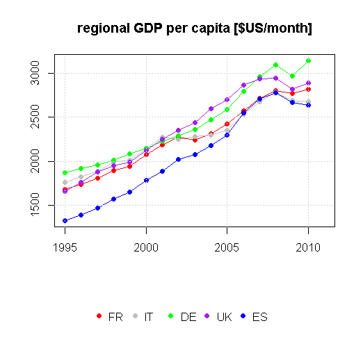
I have always heard debates on centralized vs. decentralized states, on the most efficient ways to stimulate the economy etc etc. Those debates have been going on for years and years, and usually someone shows up with a plot like this:
The GDP, as I understand it, measured the gross “output” of an economy. To some extent it correlates positively with the level of welfare, but not really (what is welfare? what about inequalities? the usual moral blabla). So it’s better to see it as an indicator that “something is happening” – and this is how I understand it now. By the way, I got the data from the OECD database.
So what does the graph tell us ? I see 4 things:
- Spain started way below France, Italy, Spain and the UK, but grew at the same rate
- From 2001-02, France and Italy slowed down (too bad, they were almost beating Germany)
- The UK and Germany didn’t seem to slow down in 2001-02, but like everyone got hit as well in 2008
- Compared to 1995: Germany together with the UK are beating us all (biggest GDP/cap and still growing), Italy got caught up by Spain and both are declining, France is stagnating.
See the updated figures from the World Bank here, we’re still seeing the same thing. Well – but what if we looked at the GDPs of each French region, and each German Länder ? The OECD database, as well as the Eurostat database, contains some stats at the regional level:
- see this page http://epp.eurostat.ec.europa.eu/portal/page/portal/region_cities/regional_statistics for the Eurostat regional statistics
- and this page http://www.oecd.org/gov/regional-policy/regionalstatisticsandindicators.htm for the OECD ones
The administrative levels and units are the same for Europe (expect for Belgium I think). There are three levels (copy/paste from Eurostat), according to the Nomenclature of Territorial Units for Statistics (NUTS :/):
- NUTS 1: major socio-economic regions
- NUTS 2: basic regions for the application of regional policies
- NUTS 3: small regions for specific diagnoses
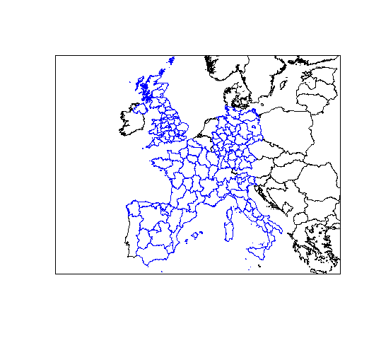
Here are the level 2 regions for France, Germany, the UK, Spain and Italy (shapefiles here):
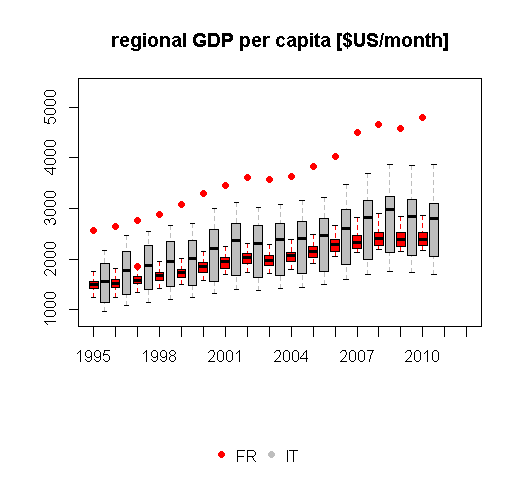
 So, let’s get back to my question. Let’s take two countries who look quite similar on the first plot (GDPs). If we use a boxplot to show the spread of regional GDPs – here is what we get:
So, well, two remarks:
- There’s one region in France (Paris), which has a GDP per capita almost twice as large as the others. The 21 other regions are all together around a mean of barely 2000$/m – which is the GDP of Estonia
- The median of Italy’s regional GDPs is higher than the one for France, there is no outlier, but there are regions that are continuously performing worse (with a GDP equivalent to the one of Estonia). Also, it seems to be moving upwards from 2001, which may be due to the fact that some regions are moving upwards while some remain idle.
Now here the same graph for France and Germany:
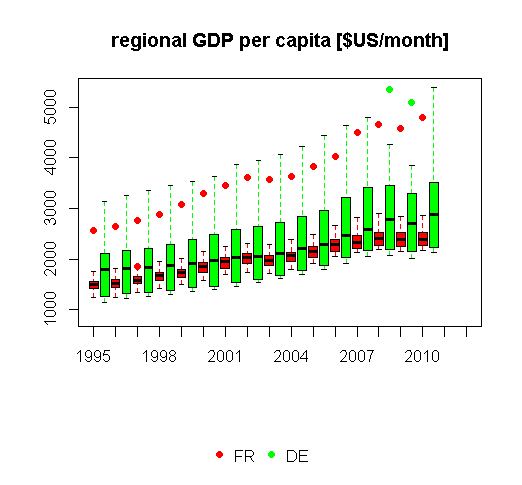 Germany seems to have a very balanced profile, and in general is performing very well (no wayyy…).
- It has regions that are performing at least as bad as French regions, but also many regions performing better, and even better than Paris.
- Compared with Italy (same “fat” profile) though, it seems that some of Germany’s best performing regions were hit a little harder by the crisis (I’m guessing that Frankfurt wasn’t doing so well). However the top ones (Hamburg and Bremen) remained leaders..
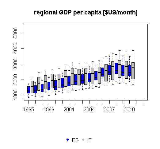
Spain shows a similar trend to Italy, but the less performing regions grew faster:
The only country which look similar to France is the UK, with a clear split between London and the rest of the regions:
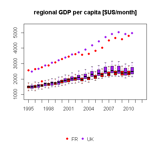 Until 2001-02, the two countries look very similar, but afterwards they diverge quite clearly: there even seems to be more than one region performing better in the UK. I’m wondering how to explain this French stagnation of 2001-02, the same happened in Italy, so there might be something to investigate here.
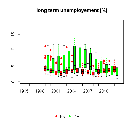
In the next post, I will look at unemployement figures. See for instance how for the first time in the last 20 years, some French regions showed a higher level of long term (>12m) unemployement than Germany:
Cheers !
R

Pingback: DIY regional pseudonomics part2 | le bord de route